Your Best Data Is Hiding in Plain Sight – Embedded Salesforce Report Charts Reveal It
 Mahendra Singh Panwar
Let's talk
Table of Contents:
- Why Traditional CRM Setups Struggle to Deliver Actionable Insights
- How Embedded Salesforce Report Charts Actually Work
- Core Capabilities, Configurations, and Integrations Explained
- What Actually Changes Salesforce Analytics Adoption
- Potential Challenges and How to Plan for Them
- Frequently Asked Question
Sixty-six percent of your Salesforce reports will never be opened again.
That is not a guess – it is the operational reality inside most mid-market and enterprise Salesforce orgs. Reports get built, assigned to folders, and forgotten. Managers run them once for a quarterly review. Reps bookmark them and never return. The data that could sharpen every pipeline conversation, every account call, every service decision stays locked three clicks deep in a tab nobody visits. The answer has been sitting inside your Lightning environment the whole time: Salesforce report charts data, surfaced directly on the pages where work actually happens.
This is a configuration discipline, not a product upgrade. What follows is an honest, field-tested account of what it takes to do it right.
Why Traditional CRM Setups Struggle to Deliver Actionable Insights
Out-of-the-box Salesforce does not fail on data quality. It fails on data proximity. Standard configurations place analytics in a Reports tab and dashboards in a separate Dashboards tab, both accessible from the app navigation bar – and both completely invisible when a rep is focused on an Account record or an Opportunity close plan.
The cognitive load problem is real. A sales rep in the middle of a discovery call is not going to pause, navigate to the Reports tab, locate the right folder, find the right report, and then return to the conversation. The behavioral economics of that friction are brutal: the more steps between intent and insight, the lower the usage rate. This is why standard CRM analytics adoption remains stubbornly low even in organizations that have invested heavily in report-building.
There is also a governance failure embedded in default configurations. When analytics live in folders, ownership diffuses. Nobody knows which version of a pipeline report is current. Different teams run different reports and arrive at different numbers. That version fragmentation destroys the credibility of analytics just as much as the access friction does.
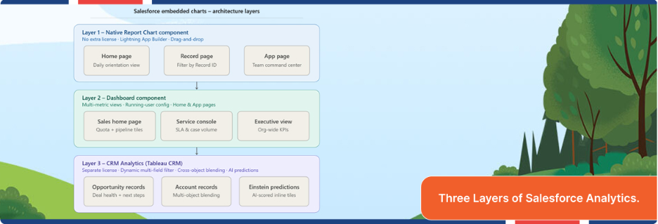
How Embedded Salesforce Report Charts Actually Work
Salesforce report charts provide three native mechanisms for embedding visual analytics into the Lightning UI. Understanding each one – and knowing when to use which – is where most implementations make their first mistake.
The Report Chart Component (Native, No License Required)
Every Salesforce org with Lightning Experience has access to the Report Chart Lightning component. It renders a chart from any existing summary or matrix report directly on a Lightning Page – including home pages, record pages, and Salesforce App Page dashboard. The configuration lives entirely in the Lightning App Builder, requires no code, and is deployable by a Salesforce admin in under ten minutes for a straightforward use case.
The technically important feature of Salesforce report charts here is the Filter by Record ID option available when embedding on record pages. This tells the component to apply the current record’s ID as a filter on the underlying report – meaning an Opportunities by Stage report embedded on an Account record page will automatically show only the opportunities for that specific account. No manual filtering. No cloned reports. One report, context-aware across all records.
The Dashboard Component
Salesforce dashboards can also be embedded on Lightning Pages using the Dashboard component. The embedded Salesforce dashboard embedding experience is less context-aware than the Report Chart component – dashboards do not dynamically filter to a record ID the way individual report charts do. They are better suited for Salesforce home page analytics and app pages where you want a fixed, multi-metric view: a sales rep’s home page showing their own quota attainment, open pipeline, and recently logged activities in a single embedded panel.
One architectural note worth flagging about Salesforce report charts: embedded dashboards pull from a running user or a specified Salesforce user, depending on your org configuration. That has downstream implications for row-level security and data visibility. If your dashboard is set to run as a specific user rather than the viewer, every person who sees it sees the same data.
CRM Analytics (Formerly Einstein Analytics / Tableau CRM)
For organizations with CRM Analytics licenses, the embedded experience becomes substantially richer. The Salesforce CRM Analytics dashboard component supports dynamic filtering by multiple record fields, cross-object data blending, and predictive tiles powered by Einstein Discovery. A CRM Analytics dashboard embedded on an Opportunity record can simultaneously show deal health scores, comparable historical deals that closed successfully, and recommended next actions – none of which are possible with the native Report Chart component.
The implementation uses the wave:dashboard Visualforce component or the equivalent Lightning Web Component. You pass the 18-digit dashboardId from the CRM Analytics URL, configure height and Salesforce report visibility setting parameters, and embed the fully interactive dashboard inline. Users can drill, filter report chart by record ID, and explore without leaving the record.

Core Capabilities, Configurations, and Integrations Explained
Home Page: The First Impression That Sets Daily Behavior
Embedded charts on the home page work best when they answer the questions that frame a rep’s day. What is my open pipeline by stage? Which accounts have no activity in the last 14 days? How am I tracking against quota this month? These are not questions that require navigating to a report. They are orientation questions – and they belong on the first screen a rep sees when they open Salesforce.
The implementation is straightforward: open the Lightning App Builder for the Home Page, drag in the Report Chart component (or multiple instances), select the appropriate reports, and restrict visibility by profile so sales reps see a sales-oriented home page and service agents see a case-volume-oriented one. Salesforce home page analytics embedded this way drive orientation without any training change.
Record Pages: Context-Aware Insight at the Moment of Decision
Record pages are where Salesforce report charts deliver the highest return. An Account record page with an embedded Opportunities by Stage chart – filtered by Account ID – gives account managers a live pipeline view without leaving the record. A Contact record page with an embedded Activity History chart shows the relationship engagement trend at a glance. A Case record page with embedded escalation or SLA trend data helps service agents prioritize without opening a separate dashboard.
The filter by record ID capability is what makes this valuable rather than merely decorative. Without it, you are embedding a static, company-wide chart on a record page – which is noisy and unhelpful. With it, every chart recalculates based on the record in view. That contextual accuracy is the foundation of embedded analytics that actually changes behavior.
App Pages: Team-Level Command Centers
App pages by Salesforce development services are custom pages you build using the Lightning App Builder and attach to a specific app – for example, the Sales app or a custom Service Console app. They function as the command center for a specific team or role. This is the right placement for Salesforce App Page dashboard components that show team-level metrics: aggregate pipeline by territory, SLA compliance by queue, or inbound case volume by channel.
The difference between an app page and a home page, architecturally, is that app pages are scoped to a specific app and can be targeted at specific user profiles or record types. That scoping makes them appropriate for team-wide analytics that would clutter a home page for other roles.
Salesforce List View Charts
Salesforce list view charts are a lower-profile but highly practical capability. When enabled, they appear as a collapsible chart panel above the list view records, visualizing the data currently displayed in the list. A sales rep filtering their opportunity list to close-this-month deals automatically gets a bar chart of those deals by stage – no separate report required.
List view of Salesforce report charts do not require any admin configuration beyond enabling the feature. Users control whether the chart panel is visible. The chart type options are limited to bar, line, and donut charts, and the visualization is scoped entirely to the current list view filter and fields. They are not a replacement for embedded report charts, but they are a zero-effort win for teams that live in list views.
What Actually Changes Salesforce Analytics Adoption
After working through Salesforce Analytics adoption across dozens of B2B organizations – from Series C SaaS companies to global enterprise accounts – the pattern is consistent: the technical configuration takes less time than the organizational work that must precede it.
The most common failure mode is not a bad implementation of Salesforce report charts. It is implementing the right technology against the wrong questions. Teams spend weeks building beautiful embedded dashboards showing metrics that managers already know and reps do not act on. The charts go live, leadership approves them, and usage drops to near zero within sixty days.
What works is different. Start by identifying three to five decisions that sales reps or service agents actually make in their daily workflow where data would change the decision if it were visible. Not metrics leadership tracks – decisions the front line makes. Which account should I call first today? Is this deal at risk? Does this customer have unresolved cases I do not know about?
Then build backward. What Salesforce report chart, surfaced on what page, at what moment in the workflow, would make that decision data-informed rather than instinct-driven? That question determines placement, report design, and refresh frequency. The result is embedded analytics CRM platform that earns usage because it makes existing work easier – not analytics that requires new behavior to access.
The secondary discipline is governance. Every embedded chart in a production org should have a named owner, a documented refresh schedule, and a defined review cadence. Embedded charts tied to stale reports become trust destroyers faster than no analytics at all. A rep who notices that the pipeline chart on their Account page does not match what they see in the Opportunities related list stops trusting the chart. That trust erosion is very hard to reverse.
Potential Challenges and How to Plan for Them
Embedded charts in Salesforce are powerful, but they carry real constraints that implementation plans must account for.
Report Type and Format Requirements
Not all Salesforce reports can be embedded as chart components. The report must be a summary or matrix report with at least one grouping – tabular reports cannot generate charts and therefore cannot be embedded. This seems obvious in principle and consistently catches teams Salesforce Sales Cloud teams off guard in practice when they try to embed a tabular export-style report.
Row and Data Volume Limits
Native Salesforce reports hit query row limits. For embedded charts running on large data sets – say, activity history across thousands of accounts, or case volume across a global service operation – native reports will time out or return incomplete data. This is the primary technical signal that an organization needs CRM data visualization in workflow, rather than the native Report Chart component.
Page Load Performance
Every embedded chart on a Lightning page adds a query to the page load sequence. One or two charts on a record page are undetectable. Five or six charts on a heavily trafficked Account page will create measurable page load degradation. The fast and slow motion embedded analytics guide puts it clearly: set a performance budget per page and stick to it. Most practitioners land at two to three embedded chart components per record page as the upper bound before performance impact becomes user-noticeable.
Visibility and Profile Targeting
The Lightning App Builder allows you to set component visibility rules in Salesforce report charts – showing or hiding an embedded chart based on the user’s profile, record type, or field values. This is a powerful feature, but it requires upfront design. Without visibility rules, you end up with charts that are relevant to one team displaying for another, which trains users to dismiss the panel entirely.
Stop Letting Salesforce Data Collect Dust in Report Folders
The gap between your current Salesforce analytics adoption, and a genuinely data-driven sales and Salesforce managed service operation is almost never a data problem. It is a placement problem. The insights exist. Getting them in front of the right person, on the right page, at the right moment in the workflow – that is the implementation challenge.
Flexsin’s Salesforce Analytics and Tableau consulting team has built embedded analytics architectures for B2B organizations from Series B through Fortune 500 scale. We identify the three to five highest-impact placement opportunities in your existing org, configure the report architecture to support contextual filtering, and deploy embedded chart components tuned to your team’s actual workflow – not a generic template.
Explore Flexsin’s Salesforce Analytics and Tableau consulting services:
Book a technical scoping session with our Salesforce Analytics team – and leave with a concrete embedded analytics deployment plan for your org.
Frequently Asked Questions:
1. Do I need a CRM Analytics license to embed charts in Salesforce? No. The native Report Chart component and the Dashboard component are available to all Salesforce orgs with Lightning Experience. CRM Analytics licenses are required only if you want dynamic multi-field filtering, AI-powered predictions, or cross-object data blending beyond what native reports support.
2. Can I embed charts on Salesforce Community or Experience Cloud pages? Yes, with some configuration. CRM data visualization in workflow dashboards can be embedded in Experience Cloud pages using the wave:dashboard component. Native report charts have more limited Experience Cloud support and typically require Visualforce pages or custom Lightning Web Components for full functionality.
3. How do I restrict which users can see an embedded chart on a record page?Use the Component Visibility rules in the Lightning App Builder. You can set filter conditions based on the user’s profile, permission set, record type, or field values. For example, show the embedded pipeline chart only for users with the ‘Account Executive’ profile and hide it for ‘Read Only’ profiles.
4. What report types support embedding as charts? Summary and matrix reports with at least one row grouping support Saleforce report chart generation and embedding. Tabular and joined reports cannot generate charts and cannot be used with the Report Chart component. If your data requires a tabular format, you will need to build a summary version specifically for the embedded chart.
5. Can the embedded chart automatically refresh when data changes?Salesforce embedded report charts component has a configurable refresh interval, typically set in hours. It does not refresh in real time by default. For near-real-time refresh behavior on high-frequency data, CRM Analytics dashboards support more granular refresh configuration and streaming data connections.
6. Is there a limit to how many embedded charts I can add to one Lightning Page? Salesforce does not impose a hard component count limit per Lightning page. The practical limit is performance – each chart component executes a query on page load. Most practitioners treat two to three embedded charts per record page as the upper threshold before page load impact becomes measurable to end users.
7. How do I ensure the embedded dashboard shows each user their own data? Set the dashboard’s running user to ‘Logged-in User’ in the dashboard properties rather than a named user. This ensures row-level security and sharing rules are applied based on the viewing user’s permissions, not a fixed account. Confirm this setting before deploying any embedded dashboard that includes sensitive pipeline or financial data.
8. Can Flexsin help migrate from embedded native reports to CRM Analytics? Yes. Flexsin’s Salesforce Analytics and Tableau consulting team handles the full migration path – from auditing existing native Salesforce report charts, redesigning the data models for CRM Analytics, and rebuilding Salesforce dashboard embedding with dynamic filtering and Salesforce Einstein analytics charts’ predictions. Flexsin’s Salesforce QuickStart package outlines the engagement structure.
